
How It’s Made
Block Prints


Mosaics and Collage


Paintings


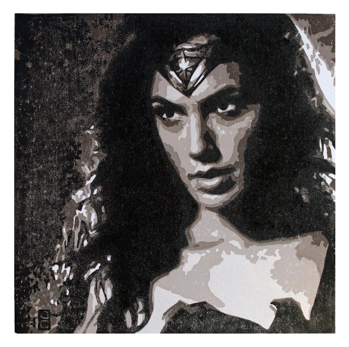
Wonder Woman reduction block print: First color (of 5) printed. At this point, the linoleum printing block has barely been carved -- just the white areas were carved away to see the white paper beneath the ink.

Second color printed. This was after carving more material away from the printing block so only the desired areas of the first color are visible.

Third color printed after carving away more material from the block.

Fourth color printed after more carving.
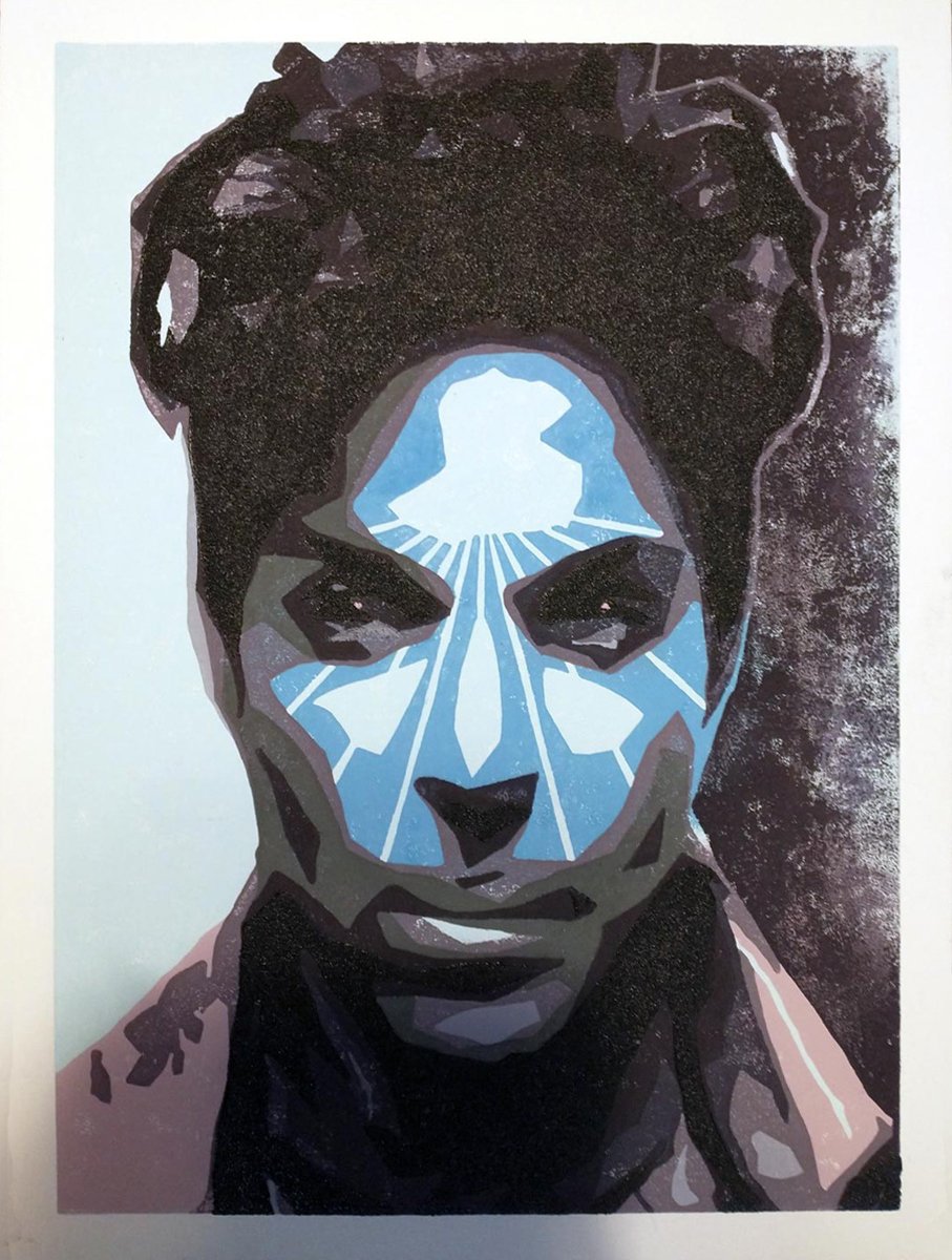
Fifth and final color printed. At this point, the linoleum block has been carved/reduced such that only the darkest color can be printed, and the block is rendered useless. To make a reduction print is to produce an inherently limited number of prints.

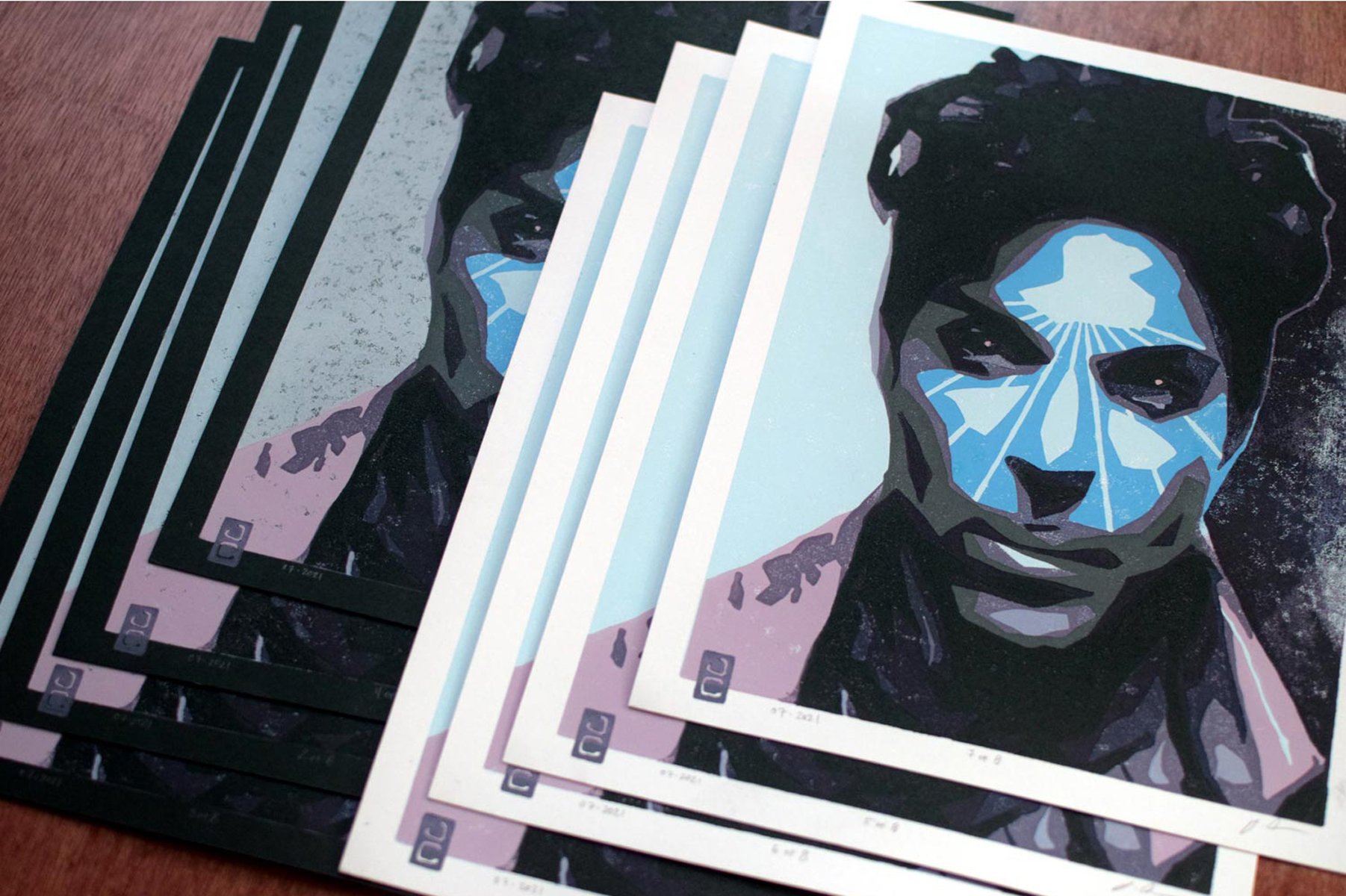
The resulting Prints. Click image to shop.

The Purple One reduction block print: There is no white in this print, so a very light blue was printed first, and the areas that are to remain light blue were carved away from the printing block. The lavender areas were spot printed -- a small section of the block is inked and printed instead of inking the entire block.

Some prints were done on black paper which required a doubling up of light blue ink in certain areas.

After more material was carved from the block, another color was spot-printed (as opposed to inking the entire block).

Another color was printed after carving more material from the printing block.

Two more colors were printed since the previous image -- the purple that makes up the hair, eyes, etc, and a spot-printing of a dark grey around the mouth.

After carving away more material from the printing block, two more colors were printed. Normally, reduction prints are done from light ink to dark. Here, a light grey was used over a darker grey to differentiate his signature stubble from the surrounding shadows.

More carving, and second to last color applied.
More material was carved from the printing block, and the final print color (purple-black) was applied. The print block that was used to ink the entire area light blue (pic 1) has been carved and reduced to print the darkest color.
The resulting Prince prints. Click image to shop.

Usually, reduction printing uses one piece of linoleum, but here, I wanted to treat this project as if it were 12 individual reduction prints to create one large image. It was a good opportunity to use up small trimmings of linoleum.

First print of background color. To the left is the first block, carved and ready to print.

The first block was carved and printed. This block required one carving, while other blocks will require 5+ cycles of printing and carving.

The 5th block in progress.
Many steps later. The 8th block is finished, and the more laborious areas are complete.

One of the resulting images -- eight unique color combos were made in total. Click image to shop.

Fred reduction block print: At the bottom, that's the linoleum block with the design transferred and some carving done. The paper above that has been spot-printed with three colors before any carving took place. Spot printing, as opposed to inking the entire block for each color, uses less ink and often saves a few steps.

This is several cycles of carving and printing later. More spot printing was done. If this was not spot printed, the entire sheet would have 6-7 layers of ink by this point.

A few carving and printing cycles later.
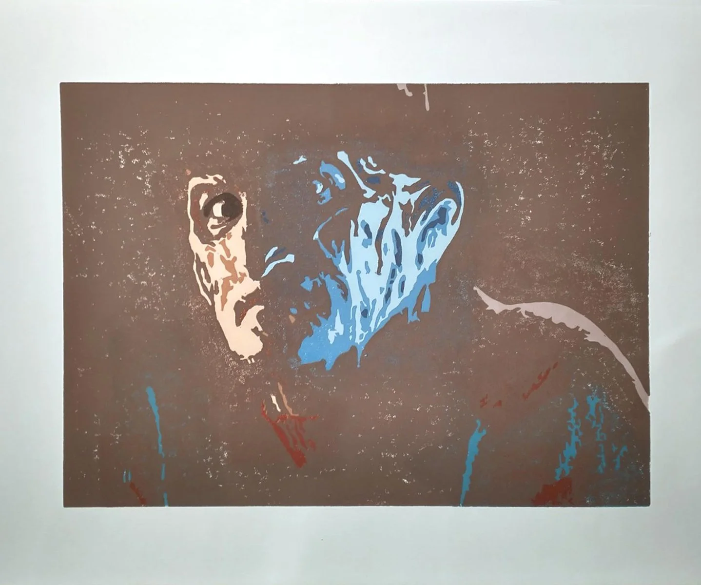
After a couple more carving/printing cycles, and with just one more carving/printing to go. Notice that there is no hat or definition around the shoulders here.
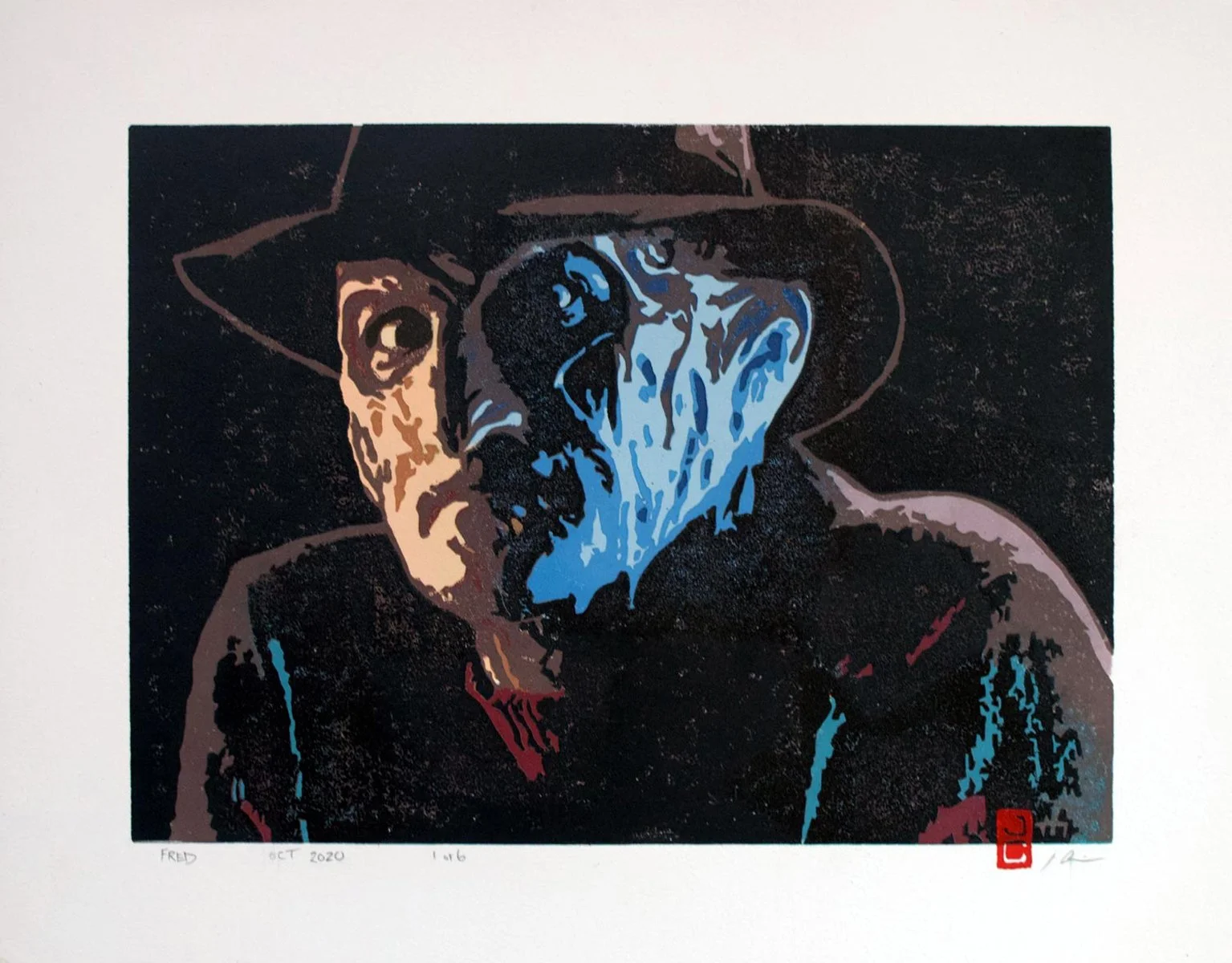
Final ink color (of 13) applied.

The resulting prints. Click image to shop.

Here, several pieces of scrap linoleum were glued to a backing board, and the image was transferred. The only parts here that were carved away were done to let the white paper show through.

Many steps later, all that's left to print is the face, around 3 colors, and the band on the hat. Upon completion, virtually no material was left on the linoleum block.

This is how the print looked in regards to the last photo.

The finished print on solid white paper. Several prints were also done on joined black and white strips of paper, trimmed from earlier projects.

The resulting prints. Click image to shop.

Scream mosaic: This is a few steps in, but before this pic, I stained an 11in x 14in wood panel, drew the pattern, and made several shades of plaster tiles -- plaster, mixed and tinted, spread on glass -- then cut, sanded, and filed into shape.

The project progressed, moving from one color tile to the next. This was a long and dusty project.

For the darkest color in the neck and throat, I used long, thin tile shapes to mimic the subject's form and mirror the upward and outward direction of sound.

When I made the background, I was thinking about audio equalizers, flames, and wings. The piece will next get a thick coat of clear casting resin.

Finished mosaic. Click image to shop.

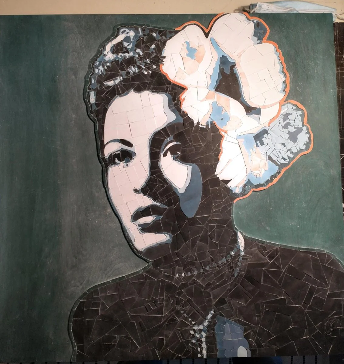
Billie Holiday mosaic: The first step in making this mosaic was designing the pattern and transferring it onto a 24in x 24in panel board.

I mixed high-pigment inks to stain the wood. A lot of the green background will be visible in the completed project, but the blue and white stain applications were done for my benefit -- to get a visual on where this was heading.

This mosaic was crafted with hand-made plaster tiles. I mixed plaster and ink, spread thin on glass, then cut, sanded, and filed into shape. The glass was used to give one side of the plaster a smooth finish.

Usually, for demanding projects, I'll opt to start on the most difficult or tedious part and get it out of the way first. I did that here with the highlights in the hair, the necklace, and the boarder surrounding her and the flower.

With all of the more detailed work completed, I could now move on to filling in the rest with black tile.

The progress was slow but steady, and very dusty.

It's likely that I had to make a fresh batch of black plaster tiles right around this point. Even when materials are as inexpensive as plaster, I'm very cautious about overproduction and waste.
Billie is complete, so on to the background. Her portion of the mosaic is very angular and shattered-looking. I wanted to contrast that and make a very structured background.

This photo was taken after plaster was mixed, spread thin onto glass, left to dry for a day, measured, and cut into strips.

Then I cut squares from the strips, rounded the edges using a wooden template and sandpaper, and dyed the edges with the same ink color as the green, wooden background.

I then dyed the plaster tiles and glued them into place, cutting and filing them into shape when necessary.

The resulting mosaic was finished with several coats of sealant. Click the image to see more photos in the shop.

Kurt Cobain newspaper collage: First, I repaired a broken 24in x 36in canvas stretcher and wrapped it in two types of medical bandage. Then I drew up a pattern.
I dyed sheets of newspaper using diluted ball-point pen ink -- four shades of blue and a couple shades of black. Then I began gluing the dyed newspaper to the pattern.

Progress photo with the tools used: dyed newspaper, glue, scissors, tweezers, and a brush to keep debris from the work surface.

I finished certain areas completely, then moved onto the next. Here, I was working on the wind-blown hair.

And now with the main subject completed, I moved onto the background. I dyed more newspaper, but with coffee this time, and laid down in orderly rows to contrast the patchwork look of the main image.

When the collage was complete, I trimmed away any excess backing paper and glued the image to the bandage-wrapped canvas stretcher. Initially, I used two colors of bandages, but opted to cover the darker shade with newspaper, first glued down, then crudely sewn into place.

The resulting work was spray-sealed and covered with a sheet of reclaimed acrylic. Click the image to check it out in the shop.

Clair, acrylic on canvas: The first step was taking some reference photos, selecting the best shot, and drawing the image on a 25in x 30in canvas.
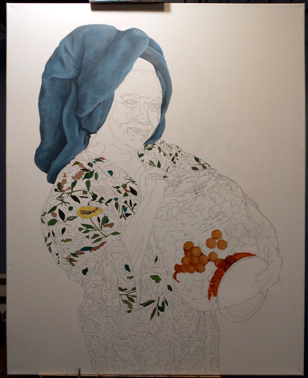
I painted the towel first, and did a few cheese balls to get the right approach, having never painted them before.

I was eager to get the eyes done and to chip away at the very complex pattern on the robe.

A fair amount of work was done on the face and arms between the last photo and this one. Next, I'd paint some more of the robe and tackle the plastic jug.

The painting is nearing completion, just have to finish the robe and the background.
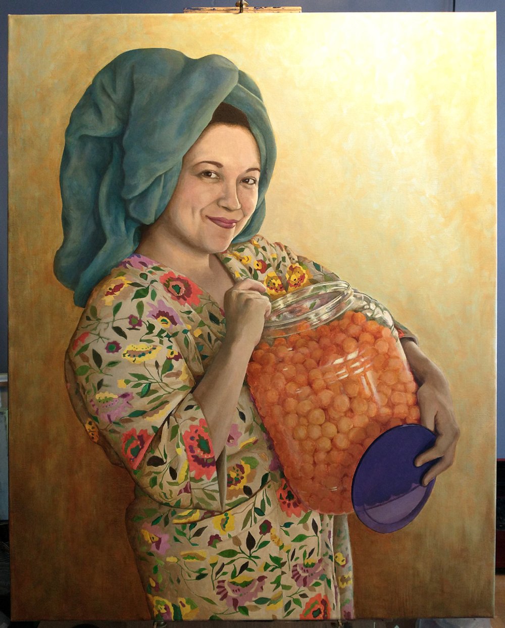
The background is mostly completed here. It's built up with multiple layers of thinned out paint.

The finished painting. A few weeks after finishing the painting, I came across this frame at an estate sale, perfect fit. Click the image to check out this painting in the store.

Eva Cassidy, oil on canvas: Like most of my paintings, this was done on a reclaimed canvas -- I get second-hand, mass produced decor items, prime them, and sketch out the subject. Here, I've already started working on her face.

The photo reference for this painting was about 30 years old and kind of drab, so I wanted to up the color saturation in the painting to make it a bit more vivid.

Started working on the hair here -- first time painting blonde hair -- and getting the background started.

Face, hand, and hair are mostly done, and more work was done on the background. The reference photo had her sitting in a plain room, but I tweaked the painting so the background is a gradual fade from light to dark.
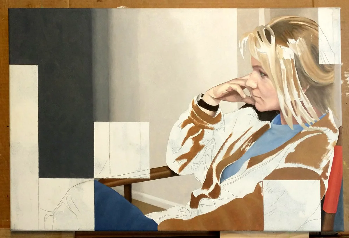
The background is mostly in place, and a warm brown under-painting was done on the sweater before going over it with cooler tones.

This is the almost-finished painting, just in need of some minor details.

Eva Cassidy painting complete. Click the photo to see it in the store.
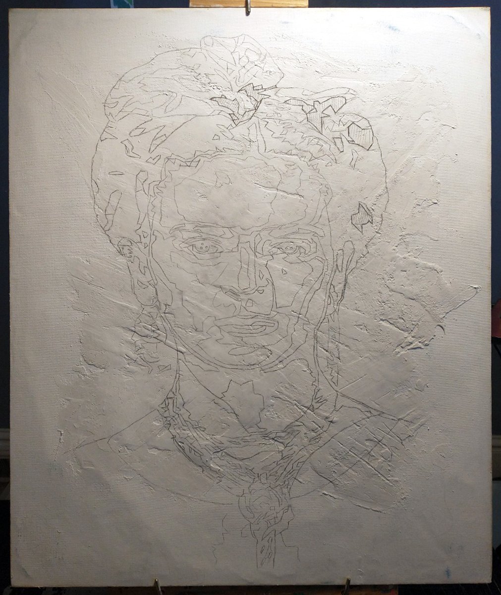
Frida Fresco: First step was to take this 24in x 30in reclaimed canvas and fill the back void with a layer of plaster for structure. Then, the front was covered in plaster and the image drawn on.

While not technically a fresco, this method is very similar. I would mix a small batch of plaster, tint with pigment, spray the area to receive the tinted plaster with water, and quickly paint with the plaster/paint mixture.

The bow and hair is laid on very thick for a lot of light catching texture.

Here, I mixed plaster with pigment, like before, and quickly applied to get the face blocked in.
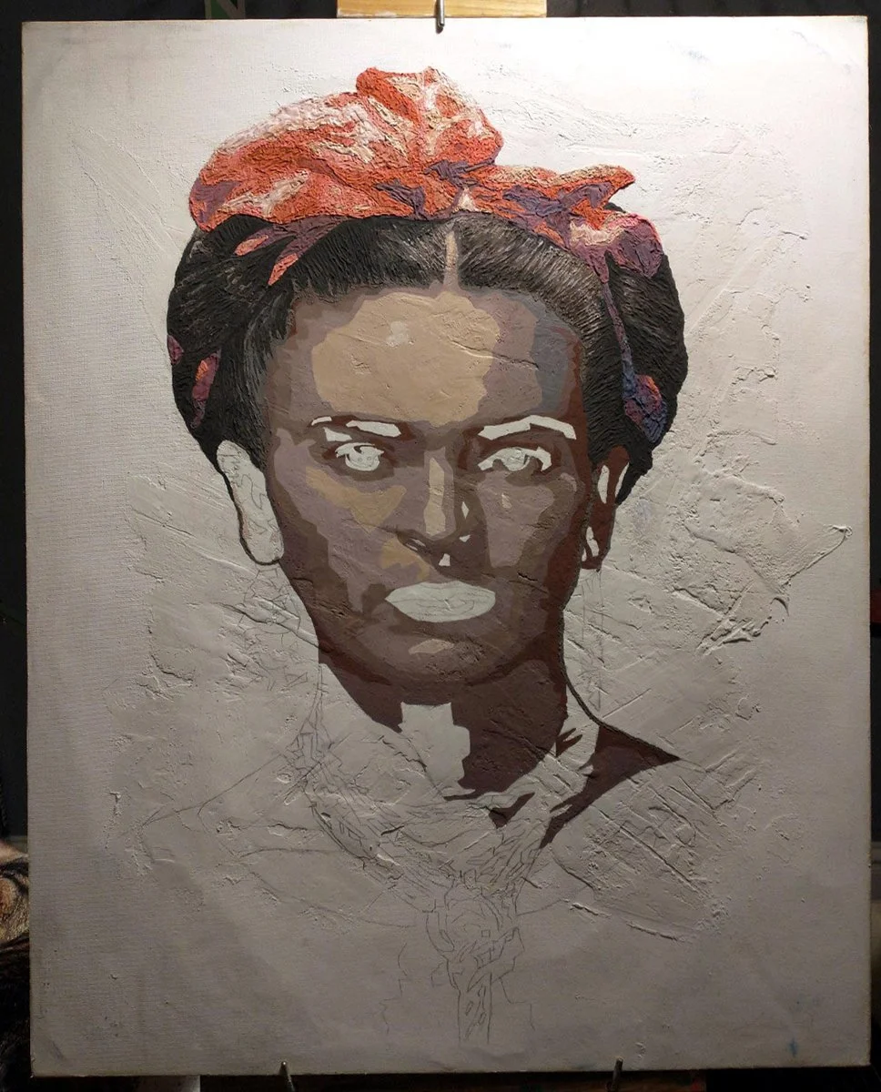
More progress in getting the basics of the face contours and different hues in place. I continued painting the blocked-in version of the face before refining later.

Here, her face is mostly blocked in, and will be refined later.

Here, with all of her skin-tones in place, I made a palette of colors, mixing in less plaster than before, and would begin the detail work. Between this photo and the next, I altered her accessories: a chunky, gold necklace became a scarf, and large earrings were reworked to better suit the painting.

Many hours of painting later, and her portrait is almost complete. Originally, I planned on painting the background gold, but decided to paint it the same color as her blue house in Mexico City -- I immediately hated it, and went with the original plan.

The completed Frida fresco. Click the image to see more photos it in the store.

Jam - oil, acrylic, and sheet music on canvas: I primed a 32in x 32in reclaimed canvas, then arranged instruments, took reference photos, and sketched the image on the canvas.

I decided to work from instrument to instrument, and started with the microphone. I did a light wash of color on the background to make better sense of things.

Next, I spent a bit of time getting the banjo roughed out. Then painted the fiddle, as that was the part I was most looking forward to.

Here, I started work on the mandolin and guitar.

All of the instruments are mostly painted here, and I started painting the necks.

The necks are mostly roughed out, to be refined later.
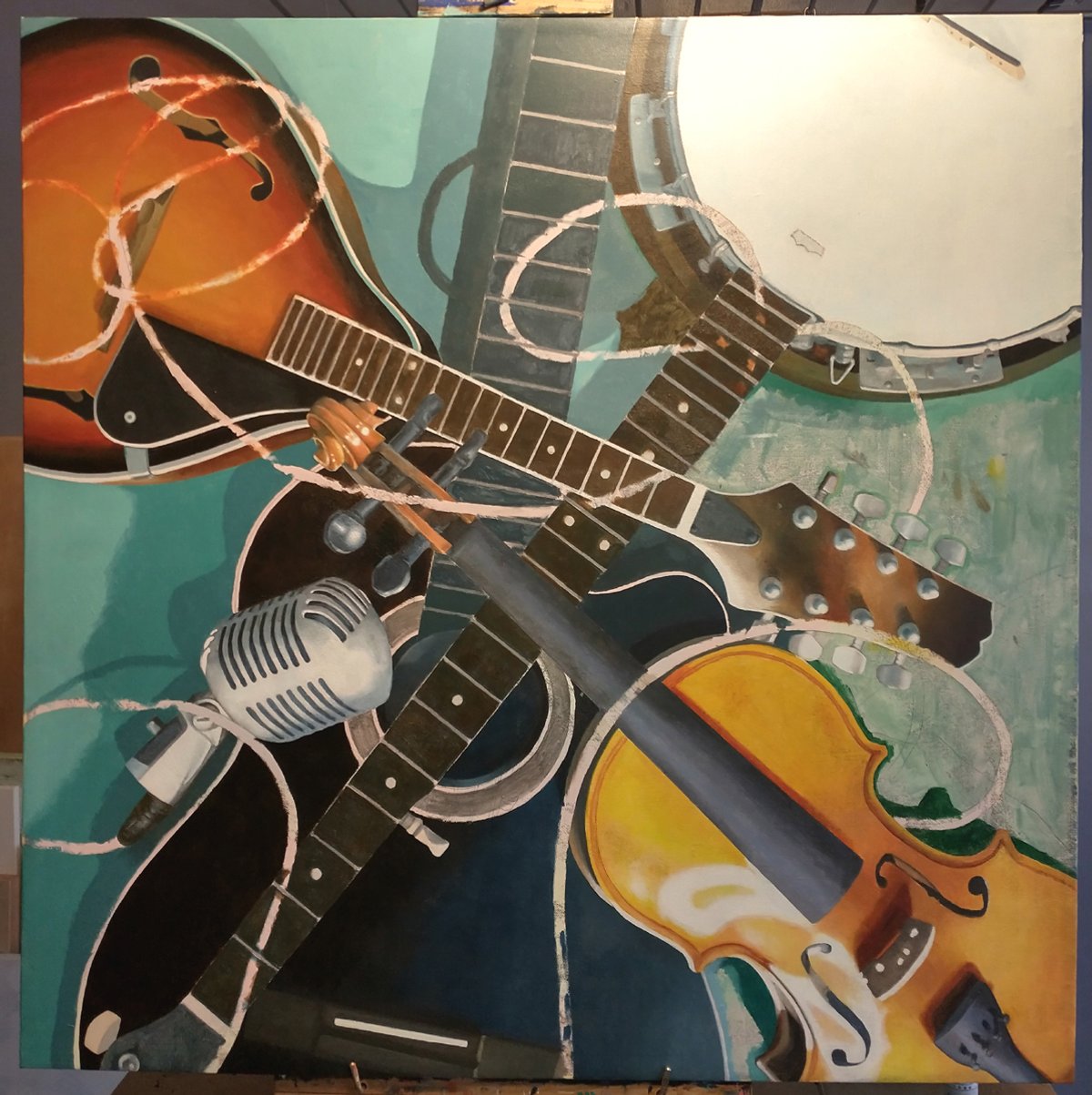
I laid in some blocky background color, to be refined later
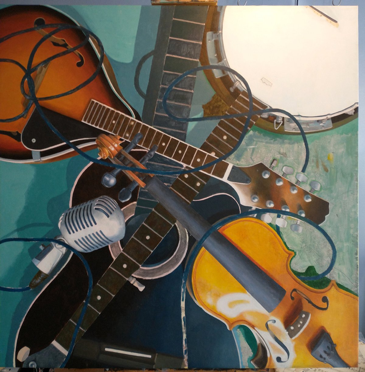
Here, I started painting the mic cable and completely lost interest in a painted background. Instead, opted to use old, torn sheet music.

I glued sheet music all over the canvas to act as the background. The plan was to lay down the old, yellowed sheet music, and paint the instruments' drop shadows with what was essential thinned out wood stain.

Drop shadows were put in place by staining the sheet music, and the instruments' necks were refined.

Some work was done on the mic cable, a lot of detail work, and between this and the next photo, I'll adjust the banjo body, both in color and with the addition of more mic cable.

Strings added, mic cable refined, detail work completed, and several coats of varnish. This piece was intended to hang in any direction; the next photo is my preference.

The finished painting. Click the image to see more photos in the store.